Crap Looking Books isn't just about intentionally judging books by their covers, and questioning if those judgements were right! It's about over-turning expectations and challenging preconceptions of books and literature. It's about asking "What on earth?" and then asking "Why?". To learn more give this a read, or head on over to our Facebook page.

Thursday 21 March 2013

I don't always ruin books with memes, but when I do..


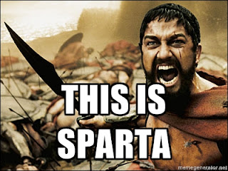
I'm really not a fan of image memes. They reduce conversation to catchphrases and stifle creativity in a way that doesn't let good ideas develop into better ones. They're lazy, trite, easily dismissed and instantly forgotten. They're the Christmas cracker jokes of digital communication. 

But what I'm finding worse is this growing trend of taking a quote from a TV show, film or book and pasting it over the top of a (usually) relevant still. They're insulting to both the medium and the context of the remark. Often the text will be a bastardisation of the original script, and the image used will be from a completely different point in the film, or be a production still.

I'm really not a fan of image memes. They reduce conversation to catchphrases and stifle creativity in a way that doesn't let good ideas develop into better ones. They're lazy, trite, easily dismissed and instantly forgotten. They're the Christmas cracker jokes of digital communication.  But what I'm finding worse is this growing trend of taking a quote from a TV show, film or book and pasting it over the top of a (usually) relevant still. They're insulting to both the medium and the context of the remark. Often the text will be a bastardisation of the original script, and the image used will be from a completely different point in the film, or be a production still. They serve absolutely no purpose other than to make those already familiar with the film or show nod with a sort of lazy nostalgia, acknowledging that yes this film was a thing and it was good, but then not taking any discussion further than the "like" button. They completely alienate anyone who isn't familiar with the original text, providing no explanation of context and generating responses of either confusion or a sort of lazy indifferent curiosity. If anyone is actually encouraged to seek out the original text, their viewing or enjoyment is askew from the start, because the significance of the scene depicted in the meme overrides what would be a normal viewing experience. They're waiting for the relevant scene, or expecting the entire text to hang off of it.  When we recommend a film to someone, we don't (unless we're 10 years old) say "Oh it was awesome, there was this one scene when..." but rather tell them what the film is about, or who is in it and what style or genre it is.Much, much worse than all this though, is when people start to post passages from books over supposedly relevant images. Books, decent grown-up books, as a rule, do not have pictures. Pictures and scenes are formed by the reader during the process of reading. If an image or scene is provided for them, something is taken away from the reading process. This is why chosing cover art is so important, and why it can sometimes go so very wrong.  To illustrate my point I've pulled the following quote from the opening of Charlotte Brontë's "Jane Eyre" and pasted it over a seemingly relevant image. There was no possibility of taking a walk that day Nothing untoward there, readers of the book will acknowledge the relevance, while those unfamiliar with it will get the right idea. But here's the text again with three different images. There was no possibility of taking a walk that day  Clearly, three very different interpretations of the same basic text. Admittedly these are very facetious and intentionally misleading examples, and come from a part of the text where the actual situation is explained almost instantly after, but they serve very well to highlight how selection of images can change interpretation of an unfamiliar text.  From the same book, here's another example.   To further illustrate the point, I'm going to do the same to a line from a book I haven't read but intend to, "Prophecy" by Peter James. I don't know if the character is supposed to be drunk, or even if they're consuming alcohol. I don't know if they're at a table or where they are, but that image is now solidified, and could easily colour my reading when I finally take "Prophecy" to task and dismantle it for Crap Looking Books. So if you want to recommend a book to someone online then do it exactly how you would in person- tell them what genre it is, tell them what it's about and what the themes are. Don't construct them images, throw out lines of dialogue or describe specific scenes or plot threads.   It's no better than reciting the "Is this a dagger I see before me?" speech and instantly expecting those listening to understand or care about Macbeth. It is insulting to the format, insulting to the craft of writing, and insulting to the creative processes that went into making the story. Share more books. Nick Sheridan xx
They serve absolutely no purpose other than to make those already familiar with the film or show nod with a sort of lazy nostalgia, acknowledging that yes this film was a thing and it was good, but then not taking any discussion further than the "like" button.

They completely alienate anyone who isn't familiar with the original text, providing no explanation of context and generating responses of either confusion or a sort of lazy indifferent curiosity. If anyone is actually encouraged to seek out the original text, their viewing or enjoyment is askew from the start, because the significance of the scene depicted in the meme overrides what would be a normal viewing experience. They're waiting for the relevant scene, or expecting the entire text to hang off of it. 

When we recommend a film to someone, we don't (unless we're 10 years old) say "Oh it was awesome, there was this one scene when..." but rather tell them what the film is about, or who is in it and what style or genre it is.
Much, much worse than all this though, is when people start to post passages from books over supposedly relevant images. Books, decent grown-up books, as a rule, do not have pictures. Pictures and scenes are formed by the reader during the process of reading. If an image or scene is provided for them, something is taken away from the reading process. This is why chosing cover art is so important, and why it can sometimes go so very wrong. 
To illustrate my point I've pulled the following quote from the opening of Charlotte Brontë's Jane Eyre and pasted it over a seemingly relevant image.

I'm really not a fan of image memes. They reduce conversation to catchphrases and stifle creativity in a way that doesn't let good ideas develop into better ones. They're lazy, trite, easily dismissed and instantly forgotten. They're the Christmas cracker jokes of digital communication.  But what I'm finding worse is this growing trend of taking a quote from a TV show, film or book and pasting it over the top of a (usually) relevant still. They're insulting to both the medium and the context of the remark. Often the text will be a bastardisation of the original script, and the image used will be from a completely different point in the film, or be a production still. They serve absolutely no purpose other than to make those already familiar with the film or show nod with a sort of lazy nostalgia, acknowledging that yes this film was a thing and it was good, but then not taking any discussion further than the "like" button. They completely alienate anyone who isn't familiar with the original text, providing no explanation of context and generating responses of either confusion or a sort of lazy indifferent curiosity. If anyone is actually encouraged to seek out the original text, their viewing or enjoyment is askew from the start, because the significance of the scene depicted in the meme overrides what would be a normal viewing experience. They're waiting for the relevant scene, or expecting the entire text to hang off of it.  When we recommend a film to someone, we don't (unless we're 10 years old) say "Oh it was awesome, there was this one scene when..." but rather tell them what the film is about, or who is in it and what style or genre it is.Much, much worse than all this though, is when people start to post passages from books over supposedly relevant images. Books, decent grown-up books, as a rule, do not have pictures. Pictures and scenes are formed by the reader during the process of reading. If an image or scene is provided for them, something is taken away from the reading process. This is why chosing cover art is so important, and why it can sometimes go so very wrong.  To illustrate my point I've pulled the following quote from the opening of Charlotte Brontë's "Jane Eyre" and pasted it over a seemingly relevant image. There was no possibility of taking a walk that day Nothing untoward there, readers of the book will acknowledge the relevance, while those unfamiliar with it will get the right idea. But here's the text again with three different images. There was no possibility of taking a walk that day  Clearly, three very different interpretations of the same basic text. Admittedly these are very facetious and intentionally misleading examples, and come from a part of the text where the actual situation is explained almost instantly after, but they serve very well to highlight how selection of images can change interpretation of an unfamiliar text.  From the same book, here's another example.   To further illustrate the point, I'm going to do the same to a line from a book I haven't read but intend to, "Prophecy" by Peter James. I don't know if the character is supposed to be drunk, or even if they're consuming alcohol. I don't know if they're at a table or where they are, but that image is now solidified, and could easily colour my reading when I finally take "Prophecy" to task and dismantle it for Crap Looking Books. So if you want to recommend a book to someone online then do it exactly how you would in person- tell them what genre it is, tell them what it's about and what the themes are. Don't construct them images, throw out lines of dialogue or describe specific scenes or plot threads.   It's no better than reciting the "Is this a dagger I see before me?" speech and instantly expecting those listening to understand or care about Macbeth. It is insulting to the format, insulting to the craft of writing, and insulting to the creative processes that went into making the story. Share more books. Nick Sheridan xx
Nothing untoward there, readers of the book will acknowledge the relevance, while those unfamiliar with it will get the right idea. But here's the text again with three different images.

I'm really not a fan of image memes. They reduce conversation to catchphrases and stifle creativity in a way that doesn't let good ideas develop into better ones. They're lazy, trite, easily dismissed and instantly forgotten. They're the Christmas cracker jokes of digital communication.  But what I'm finding worse is this growing trend of taking a quote from a TV show, film or book and pasting it over the top of a (usually) relevant still. They're insulting to both the medium and the context of the remark. Often the text will be a bastardisation of the original script, and the image used will be from a completely different point in the film, or be a production still. They serve absolutely no purpose other than to make those already familiar with the film or show nod with a sort of lazy nostalgia, acknowledging that yes this film was a thing and it was good, but then not taking any discussion further than the "like" button. They completely alienate anyone who isn't familiar with the original text, providing no explanation of context and generating responses of either confusion or a sort of lazy indifferent curiosity. If anyone is actually encouraged to seek out the original text, their viewing or enjoyment is askew from the start, because the significance of the scene depicted in the meme overrides what would be a normal viewing experience. They're waiting for the relevant scene, or expecting the entire text to hang off of it.  When we recommend a film to someone, we don't (unless we're 10 years old) say "Oh it was awesome, there was this one scene when..." but rather tell them what the film is about, or who is in it and what style or genre it is.Much, much worse than all this though, is when people start to post passages from books over supposedly relevant images. Books, decent grown-up books, as a rule, do not have pictures. Pictures and scenes are formed by the reader during the process of reading. If an image or scene is provided for them, something is taken away from the reading process. This is why chosing cover art is so important, and why it can sometimes go so very wrong.  To illustrate my point I've pulled the following quote from the opening of Charlotte Brontë's "Jane Eyre" and pasted it over a seemingly relevant image. There was no possibility of taking a walk that day Nothing untoward there, readers of the book will acknowledge the relevance, while those unfamiliar with it will get the right idea. But here's the text again with three different images. There was no possibility of taking a walk that day  Clearly, three very different interpretations of the same basic text. Admittedly these are very facetious and intentionally misleading examples, and come from a part of the text where the actual situation is explained almost instantly after, but they serve very well to highlight how selection of images can change interpretation of an unfamiliar text.  From the same book, here's another example.   To further illustrate the point, I'm going to do the same to a line from a book I haven't read but intend to, "Prophecy" by Peter James. I don't know if the character is supposed to be drunk, or even if they're consuming alcohol. I don't know if they're at a table or where they are, but that image is now solidified, and could easily colour my reading when I finally take "Prophecy" to task and dismantle it for Crap Looking Books. So if you want to recommend a book to someone online then do it exactly how you would in person- tell them what genre it is, tell them what it's about and what the themes are. Don't construct them images, throw out lines of dialogue or describe specific scenes or plot threads.   It's no better than reciting the "Is this a dagger I see before me?" speech and instantly expecting those listening to understand or care about Macbeth. It is insulting to the format, insulting to the craft of writing, and insulting to the creative processes that went into making the story. Share more books. Nick Sheridan xx
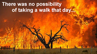
 Clearly, three very different interpretations of the same basic text. Admittedly these are very facetious and intentionally misleading examples, and come from a part of the text where the actual situation is explained almost instantly after, but they serve very well to highlight how selection of images can change interpretation of an unfamiliar text.

 From the same book, here's another example.
I'm really not a fan of image memes. They reduce conversation to catchphrases and stifle creativity in a way that doesn't let good ideas develop into better ones. They're lazy, trite, easily dismissed and instantly forgotten. They're the Christmas cracker jokes of digital communication.  But what I'm finding worse is this growing trend of taking a quote from a TV show, film or book and pasting it over the top of a (usually) relevant still. They're insulting to both the medium and the context of the remark. Often the text will be a bastardisation of the original script, and the image used will be from a completely different point in the film, or be a production still. They serve absolutely no purpose other than to make those already familiar with the film or show nod with a sort of lazy nostalgia, acknowledging that yes this film was a thing and it was good, but then not taking any discussion further than the "like" button. They completely alienate anyone who isn't familiar with the original text, providing no explanation of context and generating responses of either confusion or a sort of lazy indifferent curiosity. If anyone is actually encouraged to seek out the original text, their viewing or enjoyment is askew from the start, because the significance of the scene depicted in the meme overrides what would be a normal viewing experience. They're waiting for the relevant scene, or expecting the entire text to hang off of it.  When we recommend a film to someone, we don't (unless we're 10 years old) say "Oh it was awesome, there was this one scene when..." but rather tell them what the film is about, or who is in it and what style or genre it is.Much, much worse than all this though, is when people start to post passages from books over supposedly relevant images. Books, decent grown-up books, as a rule, do not have pictures. Pictures and scenes are formed by the reader during the process of reading. If an image or scene is provided for them, something is taken away from the reading process. This is why chosing cover art is so important, and why it can sometimes go so very wrong.  To illustrate my point I've pulled the following quote from the opening of Charlotte Brontë's "Jane Eyre" and pasted it over a seemingly relevant image. There was no possibility of taking a walk that day Nothing untoward there, readers of the book will acknowledge the relevance, while those unfamiliar with it will get the right idea. But here's the text again with three different images. There was no possibility of taking a walk that day  Clearly, three very different interpretations of the same basic text. Admittedly these are very facetious and intentionally misleading examples, and come from a part of the text where the actual situation is explained almost instantly after, but they serve very well to highlight how selection of images can change interpretation of an unfamiliar text.  From the same book, here's another example.   To further illustrate the point, I'm going to do the same to a line from a book I haven't read but intend to, "Prophecy" by Peter James. I don't know if the character is supposed to be drunk, or even if they're consuming alcohol. I don't know if they're at a table or where they are, but that image is now solidified, and could easily colour my reading when I finally take "Prophecy" to task and dismantle it for Crap Looking Books. So if you want to recommend a book to someone online then do it exactly how you would in person- tell them what genre it is, tell them what it's about and what the themes are. Don't construct them images, throw out lines of dialogue or describe specific scenes or plot threads.   It's no better than reciting the "Is this a dagger I see before me?" speech and instantly expecting those listening to understand or care about Macbeth. It is insulting to the format, insulting to the craft of writing, and insulting to the creative processes that went into making the story. Share more books. Nick Sheridan xxI'm really not a fan of image memes. They reduce conversation to catchphrases and stifle creativity in a way that doesn't let good ideas develop into better ones. They're lazy, trite, easily dismissed and instantly forgotten. They're the Christmas cracker jokes of digital communication.  But what I'm finding worse is this growing trend of taking a quote from a TV show, film or book and pasting it over the top of a (usually) relevant still. They're insulting to both the medium and the context of the remark. Often the text will be a bastardisation of the original script, and the image used will be from a completely different point in the film, or be a production still. They serve absolutely no purpose other than to make those already familiar with the film or show nod with a sort of lazy nostalgia, acknowledging that yes this film was a thing and it was good, but then not taking any discussion further than the "like" button. They completely alienate anyone who isn't familiar with the original text, providing no explanation of context and generating responses of either confusion or a sort of lazy indifferent curiosity. If anyone is actually encouraged to seek out the original text, their viewing or enjoyment is askew from the start, because the significance of the scene depicted in the meme overrides what would be a normal viewing experience. They're waiting for the relevant scene, or expecting the entire text to hang off of it.  When we recommend a film to someone, we don't (unless we're 10 years old) say "Oh it was awesome, there was this one scene when..." but rather tell them what the film is about, or who is in it and what style or genre it is.Much, much worse than all this though, is when people start to post passages from books over supposedly relevant images. Books, decent grown-up books, as a rule, do not have pictures. Pictures and scenes are formed by the reader during the process of reading. If an image or scene is provided for them, something is taken away from the reading process. This is why chosing cover art is so important, and why it can sometimes go so very wrong.  To illustrate my point I've pulled the following quote from the opening of Charlotte Brontë's "Jane Eyre" and pasted it over a seemingly relevant image. There was no possibility of taking a walk that day Nothing untoward there, readers of the book will acknowledge the relevance, while those unfamiliar with it will get the right idea. But here's the text again with three different images. There was no possibility of taking a walk that day  Clearly, three very different interpretations of the same basic text. Admittedly these are very facetious and intentionally misleading examples, and come from a part of the text where the actual situation is explained almost instantly after, but they serve very well to highlight how selection of images can change interpretation of an unfamiliar text.  From the same book, here's another example.   To further illustrate the point, I'm going to do the same to a line from a book I haven't read but intend to, "Prophecy" by Peter James. I don't know if the character is supposed to be drunk, or even if they're consuming alcohol. I don't know if they're at a table or where they are, but that image is now solidified, and could easily colour my reading when I finally take "Prophecy" to task and dismantle it for Crap Looking Books. So if you want to recommend a book to someone online then do it exactly how you would in person- tell them what genre it is, tell them what it's about and what the themes are. Don't construct them images, throw out lines of dialogue or describe specific scenes or plot threads.   It's no better than reciting the "Is this a dagger I see before me?" speech and instantly expecting those listening to understand or care about Macbeth. It is insulting to the format, insulting to the craft of writing, and insulting to the creative processes that went into making the story. Share more books. Nick Sheridan xx
  
To further illustrate the point, I'm going to do the same to a line from a book I haven't read but intend to, Prophecy by Peter James.

I'm really not a fan of image memes. They reduce conversation to catchphrases and stifle creativity in a way that doesn't let good ideas develop into better ones. They're lazy, trite, easily dismissed and instantly forgotten. They're the Christmas cracker jokes of digital communication.  But what I'm finding worse is this growing trend of taking a quote from a TV show, film or book and pasting it over the top of a (usually) relevant still. They're insulting to both the medium and the context of the remark. Often the text will be a bastardisation of the original script, and the image used will be from a completely different point in the film, or be a production still. They serve absolutely no purpose other than to make those already familiar with the film or show nod with a sort of lazy nostalgia, acknowledging that yes this film was a thing and it was good, but then not taking any discussion further than the "like" button. They completely alienate anyone who isn't familiar with the original text, providing no explanation of context and generating responses of either confusion or a sort of lazy indifferent curiosity. If anyone is actually encouraged to seek out the original text, their viewing or enjoyment is askew from the start, because the significance of the scene depicted in the meme overrides what would be a normal viewing experience. They're waiting for the relevant scene, or expecting the entire text to hang off of it.  When we recommend a film to someone, we don't (unless we're 10 years old) say "Oh it was awesome, there was this one scene when..." but rather tell them what the film is about, or who is in it and what style or genre it is.Much, much worse than all this though, is when people start to post passages from books over supposedly relevant images. Books, decent grown-up books, as a rule, do not have pictures. Pictures and scenes are formed by the reader during the process of reading. If an image or scene is provided for them, something is taken away from the reading process. This is why chosing cover art is so important, and why it can sometimes go so very wrong.  To illustrate my point I've pulled the following quote from the opening of Charlotte Brontë's "Jane Eyre" and pasted it over a seemingly relevant image. There was no possibility of taking a walk that day Nothing untoward there, readers of the book will acknowledge the relevance, while those unfamiliar with it will get the right idea. But here's the text again with three different images. There was no possibility of taking a walk that day  Clearly, three very different interpretations of the same basic text. Admittedly these are very facetious and intentionally misleading examples, and come from a part of the text where the actual situation is explained almost instantly after, but they serve very well to highlight how selection of images can change interpretation of an unfamiliar text.  From the same book, here's another example.   To further illustrate the point, I'm going to do the same to a line from a book I haven't read but intend to, "Prophecy" by Peter James. I don't know if the character is supposed to be drunk, or even if they're consuming alcohol. I don't know if they're at a table or where they are, but that image is now solidified, and could easily colour my reading when I finally take "Prophecy" to task and dismantle it for Crap Looking Books. So if you want to recommend a book to someone online then do it exactly how you would in person- tell them what genre it is, tell them what it's about and what the themes are. Don't construct them images, throw out lines of dialogue or describe specific scenes or plot threads.   It's no better than reciting the "Is this a dagger I see before me?" speech and instantly expecting those listening to understand or care about Macbeth. It is insulting to the format, insulting to the craft of writing, and insulting to the creative processes that went into making the story. Share more books. Nick Sheridan xx
I don't know if the character is supposed to be drunk, or even if they're consuming alcohol. I don't know if they're at a table or where they are, but that image is now solidified, and could easily colour my reading when I finally take Prophecy to task and dismantle it for Crap Looking Books. 

So if you want to recommend a book to someone online then do it exactly how you would in person- tell them what genre it is, tell them what it's about and what the themes are. Don't construct them images, throw out lines of dialogue or describe specific scenes or plot threads.  

It's no better than reciting the "Is this a dagger I see before me?" speech and instantly expecting those listening to understand or care about Macbeth. It is insulting to the format, insulting to the craft of writing, and insulting to the creative processes that went into making the story.

Share more books.

Nick
xx 

2 comments:

  1. Ironically, the Bronte examples make superb story prompts!
    Thanks for the post.

    ReplyDelete
    Replies
    1. I thought that too as I was making them! While there's next to nothing of Jane Eyre about them, they each seem fairly interesting in their own right!

      Nick
      xx

      Delete

Are you looking for This Is Where The Voices Go? It's over at www.NickSheridan.com!

Crap Looking Books is all about intentionally judging books by their covers, and finding out whether or not those judgements are right! It's not about taking a swing at popular trash fiction, or rubbishing on (SOMETHING). Head on over to our Facebook page to join the debate and make suggestions for future books you want to see judged,